1-17
Typeface Classification by Martin Plonka
This typographic design has a radial access point making it radial symmetrical. It is depicted as the pupil and the iris of an eye.
2-17
Go Font Urself by Sydney Melbourne
The lines in the design are equally distributed. Go font yourself design is displayed symmetrically with an even line weight. This is a form of line art because it is a black and white design. There is no gray values shown throughout the piece.
3-17
One by AndyStewart
This design was created using formal balance. Balance was portrayed by the contrast of values and the sizing of the lines. It may appear to be the number one on the right side of the piece but really thats because of the lines being heavily emphasized on the right. Really the display is two keys on top of each other.
4-17
layered paper sculpture by Bianca Chang
The layered paper sculpture is radial balance. The elements seem to radiate out from the center the center in a circular fashion. Your eye is led to the middle of the design as a focal point because that is where everything appears to be coming out of.
5-17
Contrabrand by Swiss Side
This design is asymmetrical design because the weight of the heads are unevenly distributed. You can tell by the nose of the character on the left being more slightly showing the the nose on the left of the character on the left.
6-17
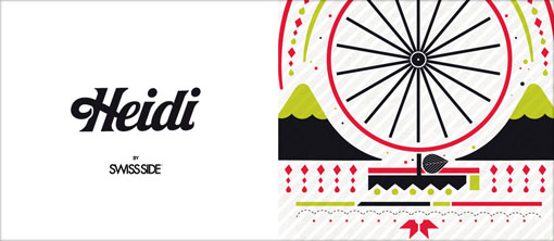
Contrabrand by Swiss Side
This photograph is evenly distributed in a symmetrical balance because of the color and the number of lines on the wheel.
7-17
Contrabrand by Swiss Side
This is radial balance as the lines are distributed evenly on the Ferris wheel. The details are evenly distributed on each side. What makes it asymmetrical is the leaf that breaks the symmetrical order in its balanced form.
8-17
Union symbol by Alastair Reid, managing director of Brighton-based Red Design.
The logo is centered. It is considered a symmetrical radial balance. The line weight is equally distributed. The "U" stands out because it is in the center and its line weight is emphasized my its thickness.
9-17
Black Light by Shen Foo of Edinburgh-based H&A Marketing and Design.
The design is evenly placed in a diagonal view. It is distributed on two pages. It is radial balance because it focuses on the middle. The design is very circular.
10-17
Bike by Normann
This photograph of a bike is displayed in an asymmetrical format. What throws the symmetry in this photo is the break line on the left side of the photo connected to the bike handle
11-17
Logo by Martin Newcombe
The logo of the tool is asymmetrical. Although the end of the tool makes a perfectly symmetrical house shape. The handle is turned at the top creating the visual weight to fall on the right side just looking at the top.
12-17
Chocolat Factory by ruiz+company
The photograph of the chocolate is very symmetrical as far as the placement of the chocolate but the color of the wrapping and its text makes the photograph asymmetrical.
13-17
Happy Pills by Identidad
The photograph on the left is asymmetrical because of the placement of the text. The photograph on the right design is symmetrical because of the placement making a visual balance.
14-17
Mas Romaní by Dorian
This photograph of the wine bottle is radial balance because the distribution of the design on the bottle. The colors and the details of the design creates a circular motion that leads your eye to the middle.
15-17
WANKEN by Shelby White
The photograph of the scale is asymmetrical because of the visual weight leading your eye to the colors on the scale that leans more towards the right.
16-17
Clothilde, ink on paper, 1998 (c) Ruth Marten
This design is symmetrical balance because not only can you fold the paper and the design will meet up evenly but the color distribution is evenly placed shadow and all.
17-17
M i m é s i s by Sarah Garzoni
This photograph of this beautiful us asymmetrical. Even thought the colors and the design of the butterfly appears to be evenly placed the size of some of the shapes are different. Also, the barcode makes the balance asymmetrical.